Summary
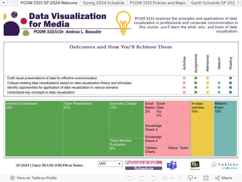
Creating a syllabus that is an interactive data visualization provides learners a more exciting way to engage with the "class contract."
Rethinking Data
Data is everywhere—even in the syllabus.
For the course “Data Visualization for Media,” I wanted to do something special: create a syllabus that allowed for an interactive exploration of the course’s core concepts and demonstrated what learners could achieve by the end of the class.
As many students first learn about data and data types in this course, this data viz also encourages critical consideration of what constitutes data, how it can be sorted, counted, calculated, and, of course, visualized.
My goal was to design a syllabus that was more than just a to-do list for students. An interactive syllabus as a data visualization is a playful, yet practical entry point into the course.
Also, it’s both visual and, well, fun!
Design Process
My initial process was creating a workbook in Excel with multiple sheets, including course outcomes, readings with due dates and hyperlinks, and tasks (to do, assignments, labs) with descriptions and due dates. I created identifier keys and categories for each item to make it easy to sort and/or filter.
After my data was (relatively) ready to go, I began playing in Tableau. For me, Tableau is “play time” as I explore different options and opportunities. I knew that I wanted a Gantt chart for the course timeline, and I also wanted to make use of tooltips: students could hover over an assignment or lab and see a brief description and due date. Other than that, however, I was open to the possibilities (as long as they reflected best/better practices).
The syllabus presented quite a few challenges:
- balancing findability with andragogy/pedagogy. Syllabus UX is tricky, as most students simply want to know what’s due and when, instructor contact information, and late/ absence policies. However, the goal of this syllabus extended beyond users achieving specific tasks, requiring negotiation. (A new iteration of the syllabus will hopefully achieve this more gracefully)
- demonstrating how each aspect of the course facilitates achieving the learning outcomes. (While students might not care about this as much while in the thick of the semester, as they complete the course, the visualization helps them to recognize how far they’ve come.)
- integrating the program branding (icons and palette)
- maintaining consistent spacing and readability across different devices.
A final challenge? Time. After creating the data, I purposefully allowed myself only a few hours to create the visualization and limited elements to those taught in the class. As I’ve said before, this specific syllabus is a demonstration of what learners will be able to achieve by the end of the course.
Accessibility
While designing the syllabus as an interactive data visualization is one method of communicating the expectations and work of the course, it is not the best method for all users. For that reason, the syllabus is also provided as an accessible PDF and as a web page in the Blackboard LMS.
Current Iteration
This syllabus is still “under construction.” For Spring 2024, I opted to map outcomes to coursework with a bubble map; this will likely change. While the data and the design are revised each semester, the iterations are a labor of love.
Final Thoughts
For me, the appeal of this project is that it merges creativity with practical application. The data viz syllabus takes what is often a dry and somewhat boring document and elevates it to an engaging experience that embodies the subject matter and (hopefully) excites learners.
The interactive syllabus goes beyond listing what learners will do in the course; it shows learners what they can achieve.